E-Commerce at 35,000 feet
Major UK Airline / Web, Mobile, IFE, iOS
End-to-end e-commerce redesign for a major UK airline. Launched across web, mobile, and in-flight entertainment on the A350. Validated on a dedicated test flight before passenger rollout. Featured in the press on launch day.
CLIENT
Major UK Airlines
MY ROLE
I led the product design across web, mobile, IFE, and the crew iOS app. Which includes: Discovery, user research, UX and UI design, Usability testing - including in-flight usability testing on a dedicated aircraft.
COLLABORATION
Product owner, Business Stakeholders, Enterprise Architects, Business Analysts, Brand team, QA, Developers, and Cabin crew.
The Impact
Another favourite? You can order anything from the menu using your in-flight entertainment, and have it delivered to you at your seat or at the “loft bar”. It's super easy.
You'll see the progress of the order, and with any luck, it'll be with you very shortly. I tested it once, and it was tap to cheers in about 3 minutes. Much easier than using the dreaded and crew hated, call button. Those days are over now, thankfully.
Featured in press at the A350 launch
The Process
We adopted Dual Track Agile with a Scrumban approach, keeping design two sprints ahead of development throughout. This buffer is what made the A350 deadline achievable.
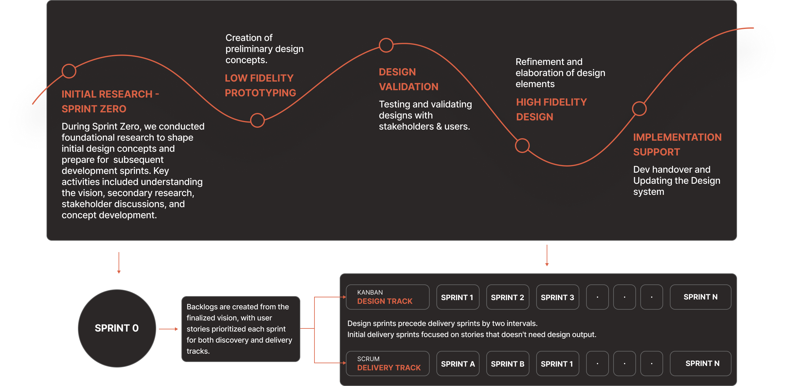
Sprint Zero: Setting the vision
We started with a stakeholder vision workshop. Bringing together department leads, engineering, and design. The output was a structured roadmap.
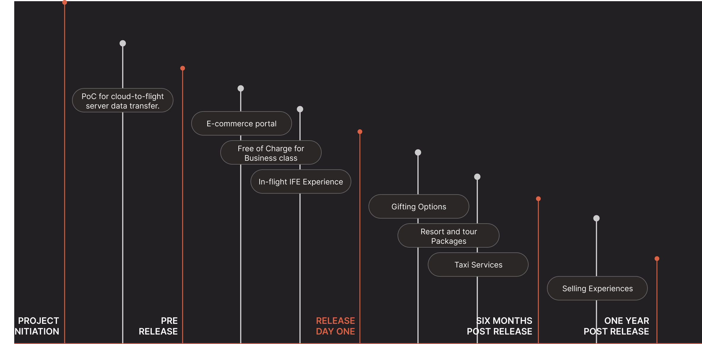
Phase 1 scope included e-commerce portal, business class free-of-charge experience, in-flight IFE and the PoC for cloud-to-flight server data transfer.
Research
Six opportunity areas emerged out of our various research methods. Usability testing ran sprint by sprint, with cross-functional reviews and rapid iteration focused on the highest-impact improvements.

Course Correction
The cloud-to-IFE data sync issue was identified as a risk at project start, but its impact was underestimated. The aircraft’s IFE server cannot sync automatically with the cloud, so data cannot move in real time between ground and cabin. As a result, inventory, pricing, and availability could not stay updated after departure. With limited engineering options and a fixed timeline, the passenger experience had to remain uncompromised.
We designed a solution that was not ideal, but it was the right one for the aircraft's constraints. It delivered a seamless passenger experience, maintained data accuracy, and the product shipped on time.
Not what we’d build from scratch, but the right design response to how the aircraft operates in reality. It kept passenger experience seamless, data accurate and product shipped on time.
One Vs three delivery contexts
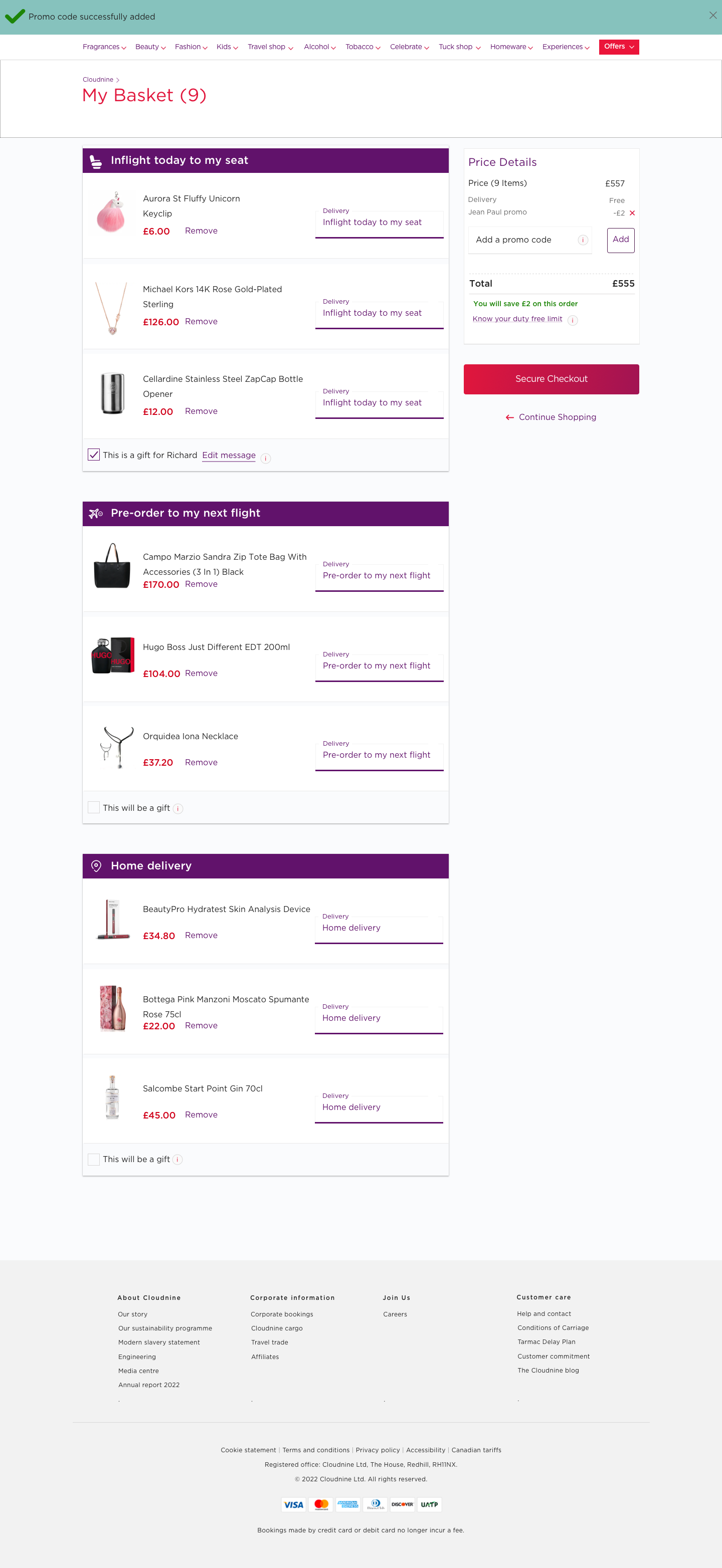
Standard checkouts handle one delivery context. Ours had three: in-seat for current flight, pre-order for future flight, or home delivery. The design had to make this feel simple, considering distinct information, and confirmation logic for each.
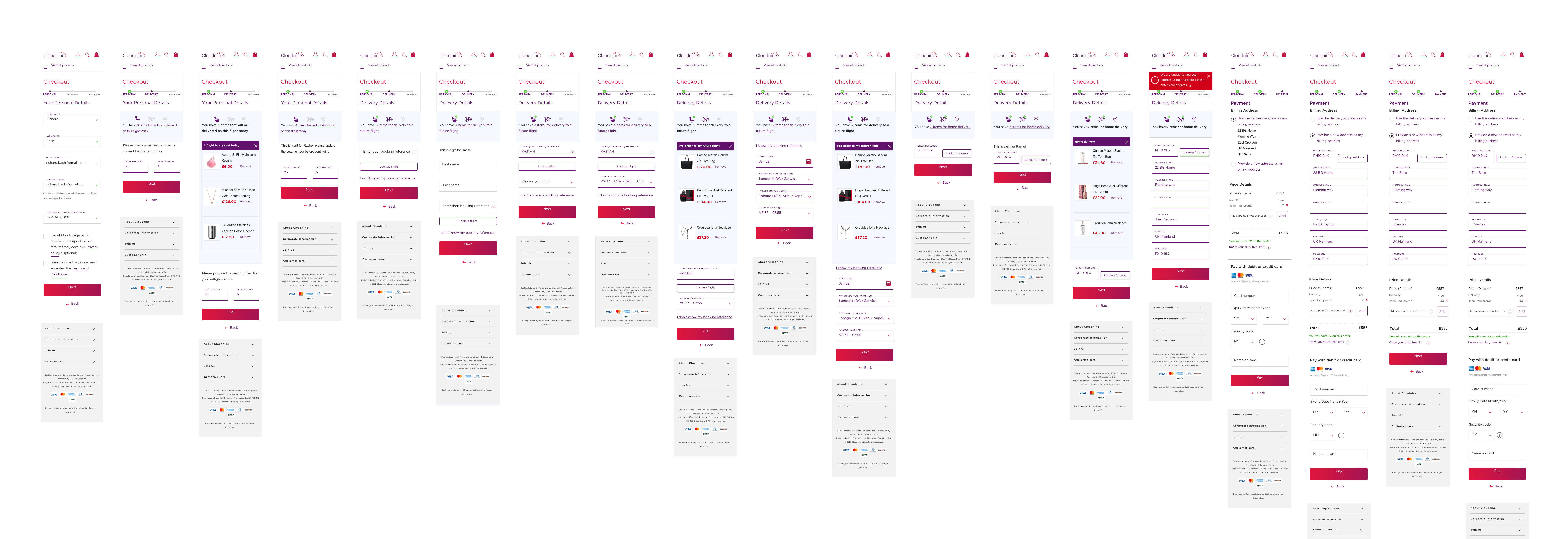
Click the image to enlarge and view the details more clearly.
Click the image to enlarge and view the details more clearly.
What Shipped
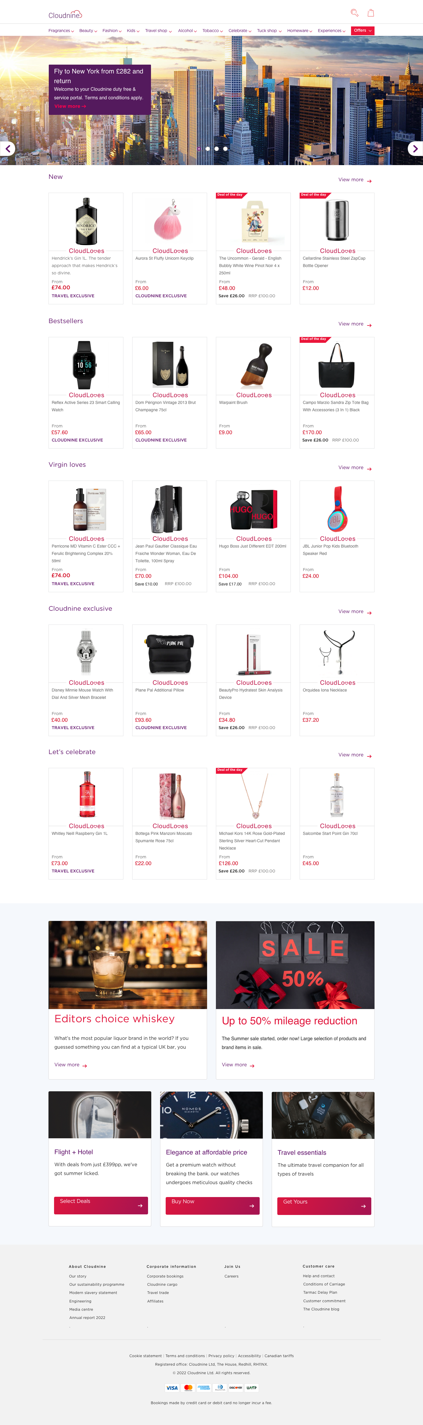
Home Page
The home page brought curated travel products into a single browsable experience. Designed to work on the ground and in the air, with consistent navigation across surfaces.
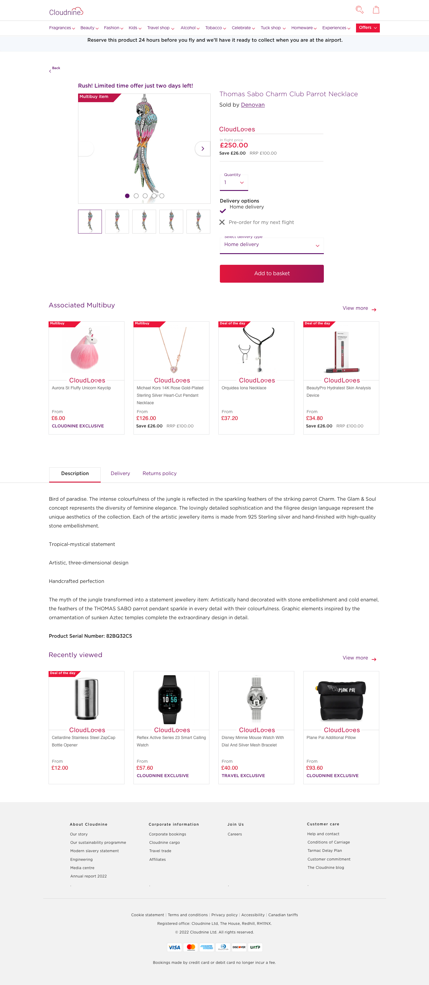
Product Detail
Product detail pages balanced commercial clarity with airline brand standards. Delivery options surfaced at the point of decision: in-flight, future flight, or home.
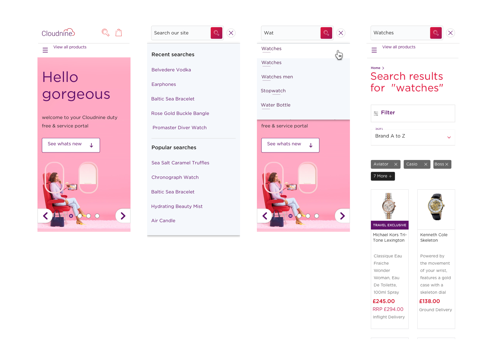
Mobile Access And Enhanced Search
The platform had no mobile access before this project. Type-ahead, recent searches, and faceted filtering. All optimised for a traveller context.
Food & Beverage experience
The platform also included a dedicated Free of Charge Food and Beverage experience for Upper Class passengers on the A350. Its own home screen, navigation, and information architecture. Designed within the same system, consistent with the retail experience, but built around a completely different passenger need.
The Rework Moment
Usability testing across sprints did not just validate decisions, it changed them. Key improvement that emerged are:
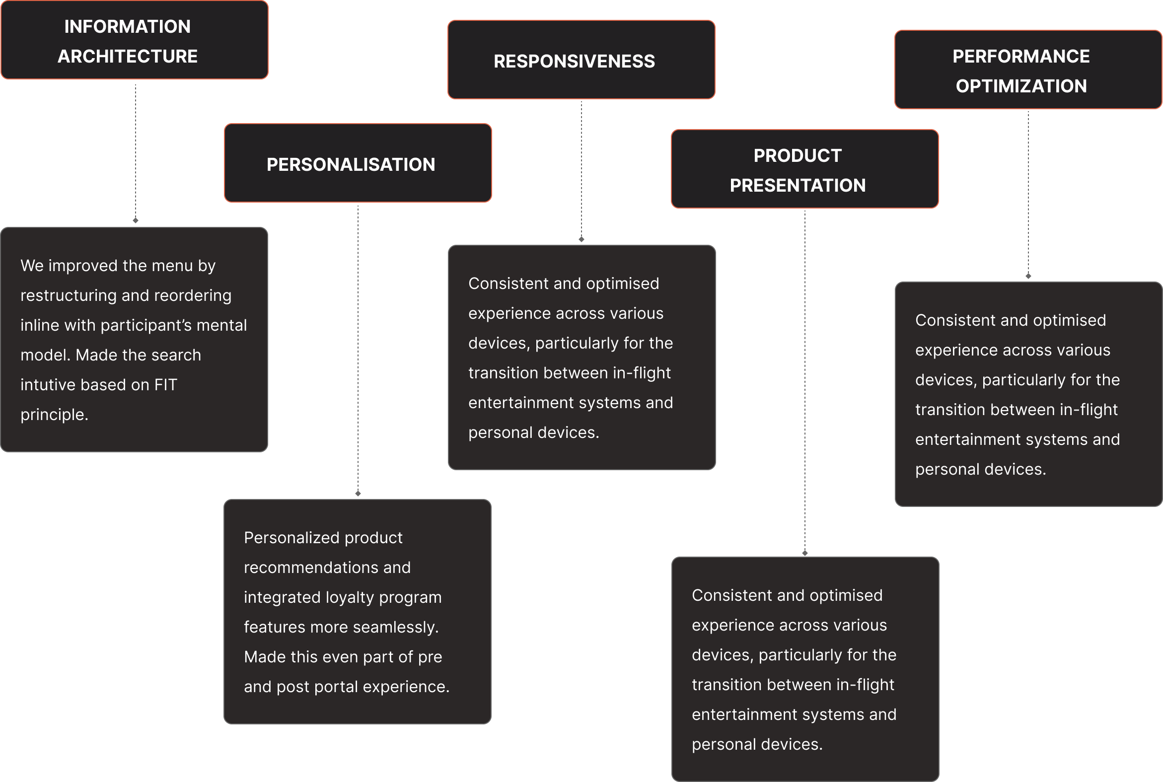
The most significant shift was in information architecture. Early navigation was structured around product categories. Testing showed that passengers navigated differently in a travel context. By intent and destination, not by product type. The menu was restructured and reordered to match how travellers actually think. Search was made intuitive based on the FIT principle. That single change affected every surface.
In-Flight Usability Testing
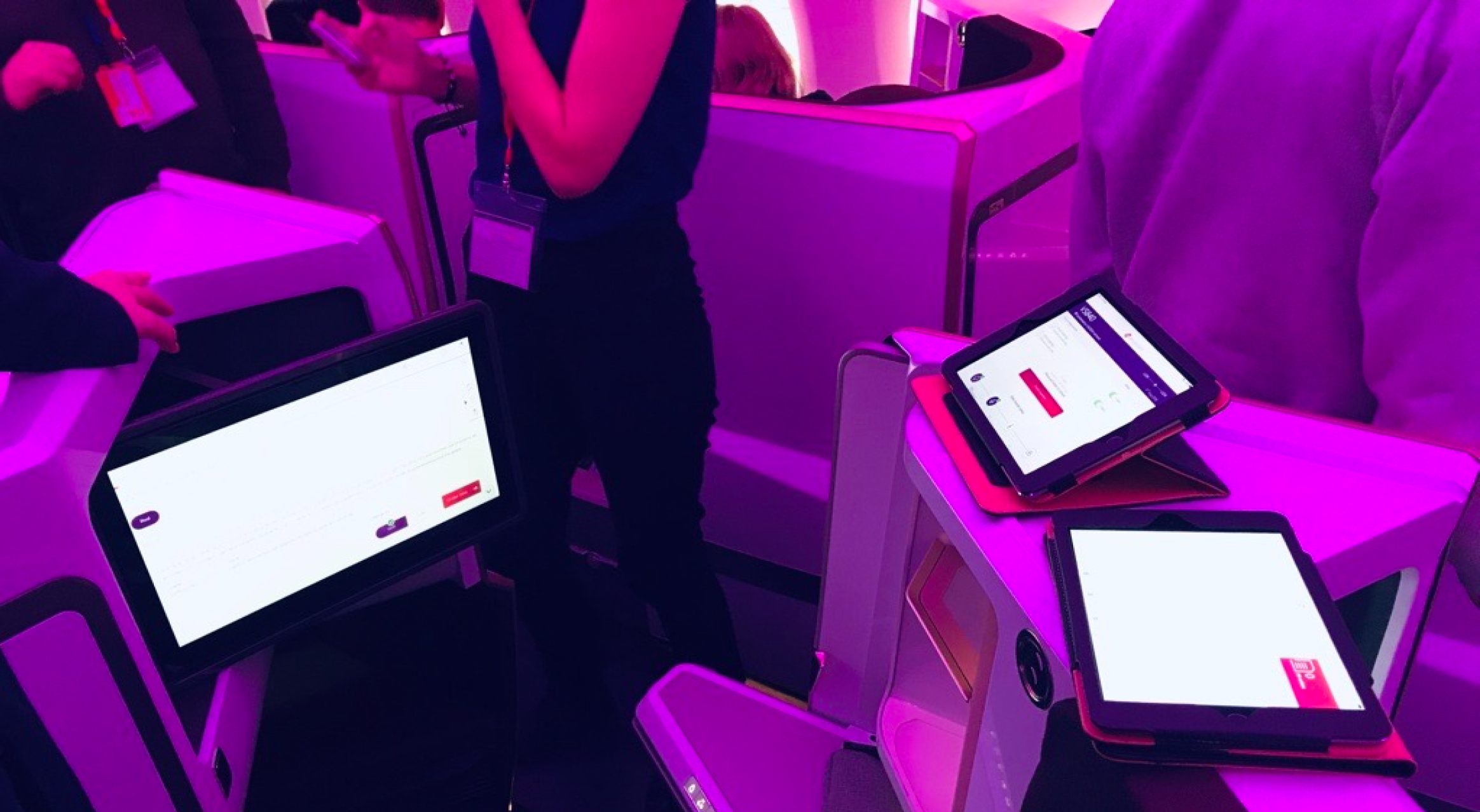
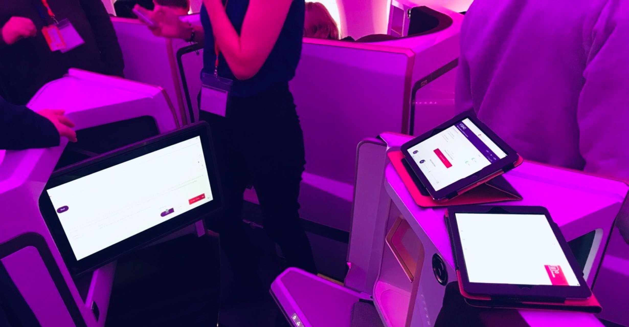
Before the experience reached passengers, we took it to altitude. A dedicated test flight. Approximately 20 to 25 participants: cabin crew, business stakeholders, and QA team members. In a real cabin, using real in‑flight entertainment hardware, under real conditions.
Business stakeholders on the flight were excited about the new features and eagerly photographing the screens to share with their teams, giving authentic, real-time feedback.
The objectives were specific. Validate the experience in real in-flight conditions. The gesture interactions, swipes and long presses for repetitive tasks, were validated under real working conditions. One-handed operation while actively serving passengers. That is not something a desktop prototype can simulate.
What We Learned
The A350 raised the bar mid-project
The new aircraft had a larger screen and more advanced interaction capabilities than the original brief accounted for. Last-minute design adjustments to meet the press launch. Dual Track Agile gave us the headroom to absorb that without slipping the schedule.
The design system that changed
New branding arrived during active design work. We realigned fast, without losing the deadline. Adaptability under pressure does not show up in a prototype. It shows up in how a team handles the moment.
The crew app was not in the brief
It became the project. When the data sync constraint surfaced as a full design problem, the choice was to compromise the passenger experience or solve the underlying operational problem properly. We solved it.
The Result
The intuitive gestures, like swipes and long presses, make it easy to perform repetitive tasks with one hand, especially when the other is occupied serving passengers, or pushing the service trolley.
Flight Stewardess
More Case Studies
Platform that Saved £0.25M annuallyProject type