An AI readiness app, designed for iPad
A large UK enterprise / iPad, Mac
An iPad app showing leadership whether the organisation is ready for AI, before anyone judges the return. Shaped with leadership and portfolio managers, designed and coded by me, and now with the development team for a native build.
CLIENT
A large UK enterprise
MY ROLE
Lead designer and builder, from discovery to a signed-off, working prototype. Research, strategy, UI, motion, accessibility and the AI build.
COLLABORATION
Leadership, portfolio managers and the people using AI day to day. QA tested the prototype before development began. Handed to the development team for the native Swift build.
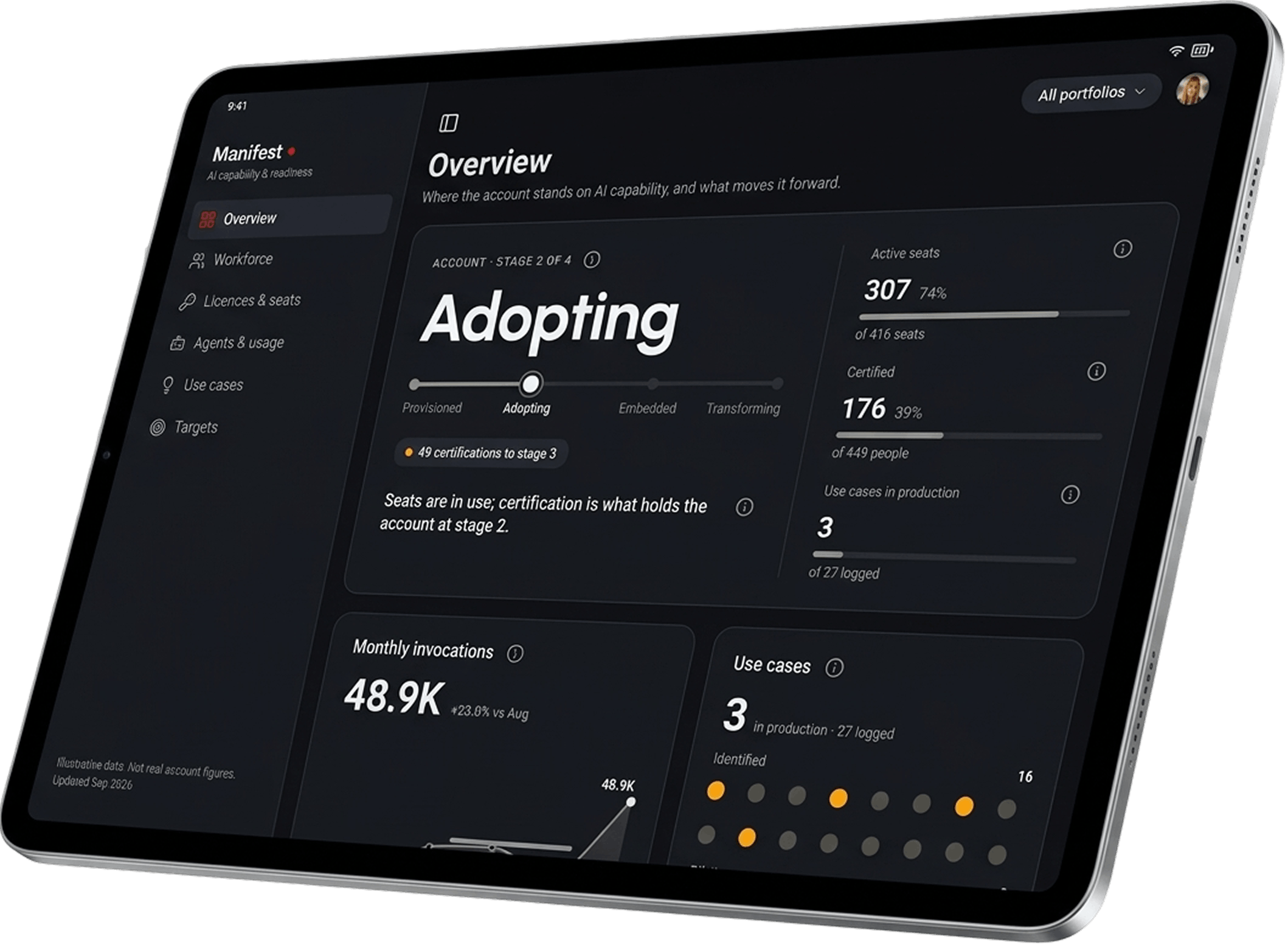
The Impact
Under 3 Weeks
From first stakeholder conversation to a working app
Real App
Stakeholders tapped through it with realistic data, not static screens
Early QA
Testing started before development did
62
States audited
The Ground Level
Then I went where the work happens. One-on-ones and deep dives with portfolio managers and the people using AI every day.
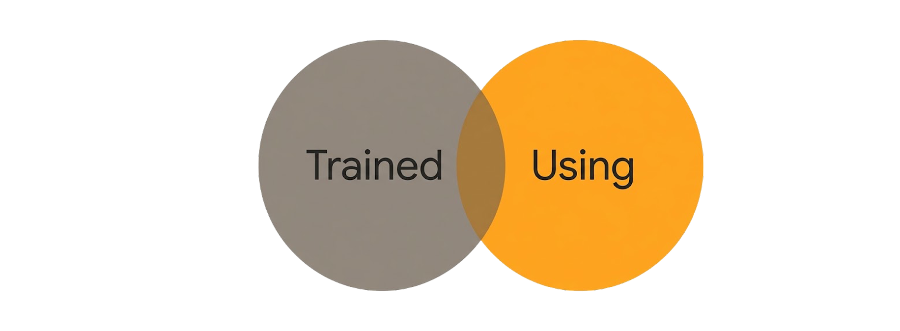
Two findings changed the brief. The people being trained weren't the people actually using AI. And some were reaching for tools the organisation never provided, like Gemini, for quick fixes. Why, when they'd been given their own? That's still the question I'd most like answered.
The Pivot
We stopped asking if AI was paying off. We started asking if the organisation was ready.
Is it equipped, and are people using what they've got? Returns can wait until there's something real to measure. Their leadership tools are native iPad by default, so that's where the answer had to live.
So I built it. Mostly by briefing AI the way I'd brief a designer.
Built with AI
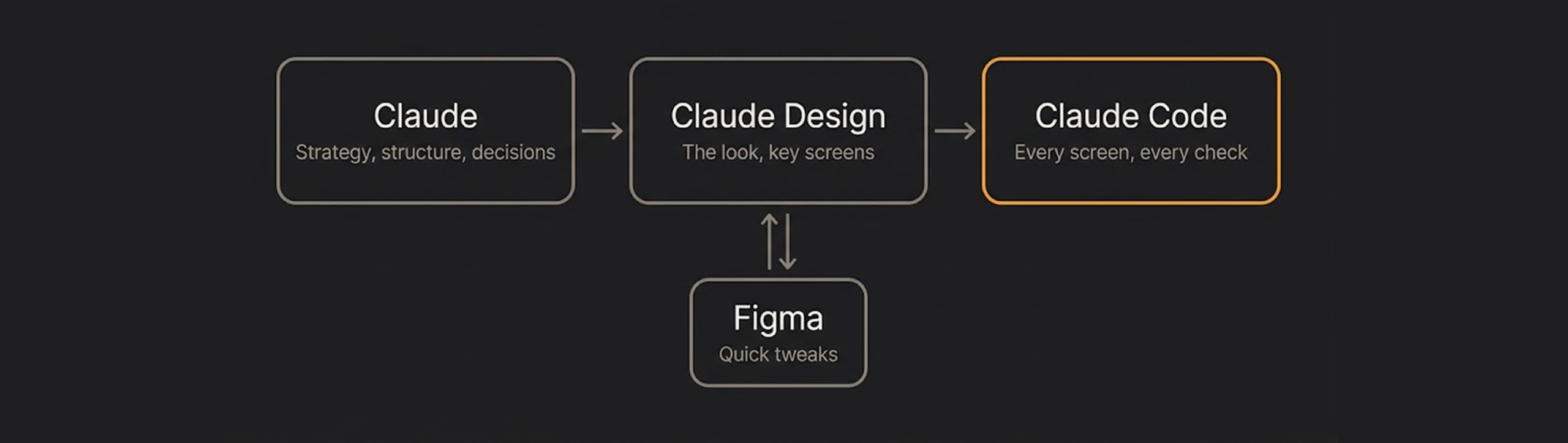
Claude was where I thought: strategy, structure, every touch decision settled before building. The look took shape in Claude Design. When a tweak was quicker to show than describe, I made it in Figma and sent the screenshot back with comments. Claude Code built every screen.
Rough sketches and reference shots for layout. GIFs and short clips for motion. A picture got there faster than a paragraph.
Speed wasn't the hard part. Trust was.
Every problem a review caught became a rule, and every rule became a check.
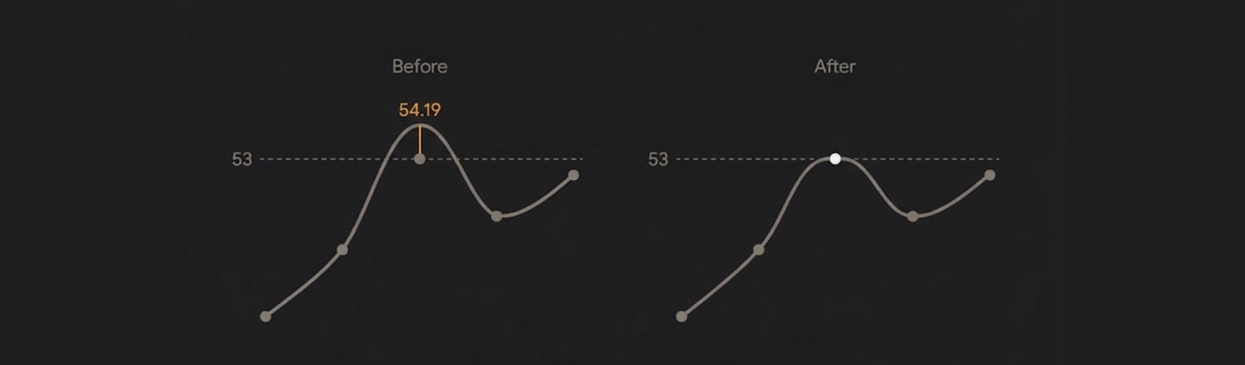
A smoothed chart line peaked at 54.19 when the real maximum was 53. Now no curve can overshoot its data.
Iteration Moment
Early on, Targets said 3 of 4 targets were on pace. Those run rates had been typed in.
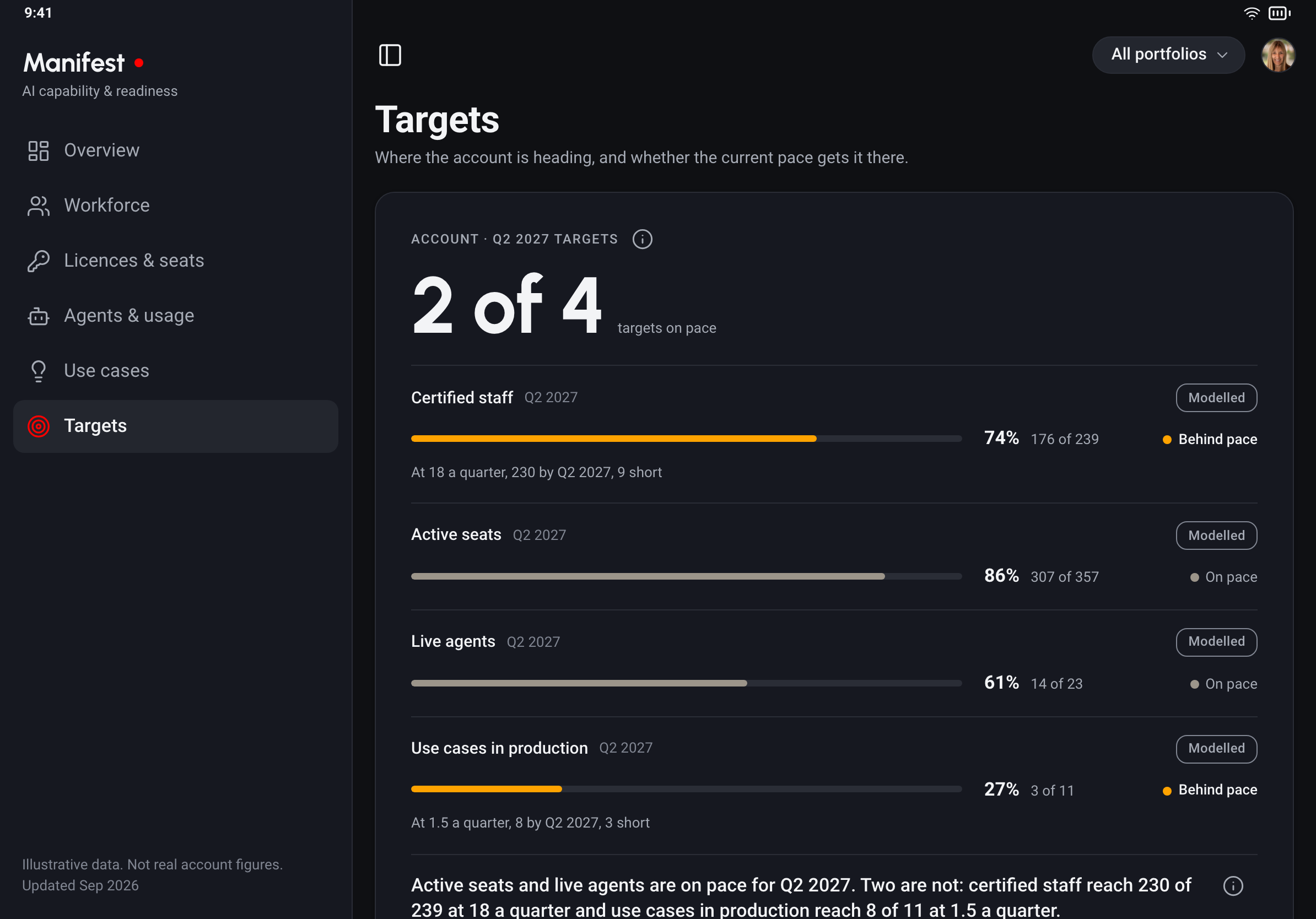
Once the build derived them from quarterly history, one target fell behind. The headline dropped to 2 of 4.
We reported it. We didn't tune it back.
What Shipped
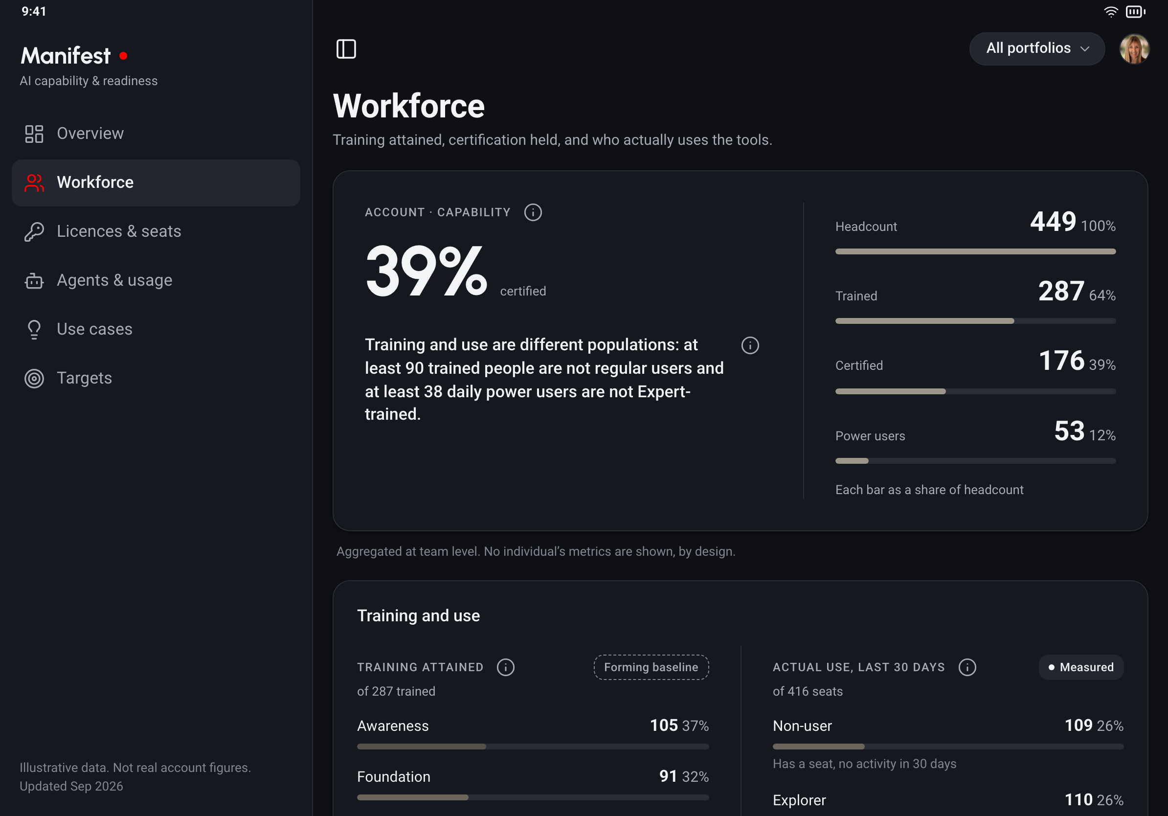
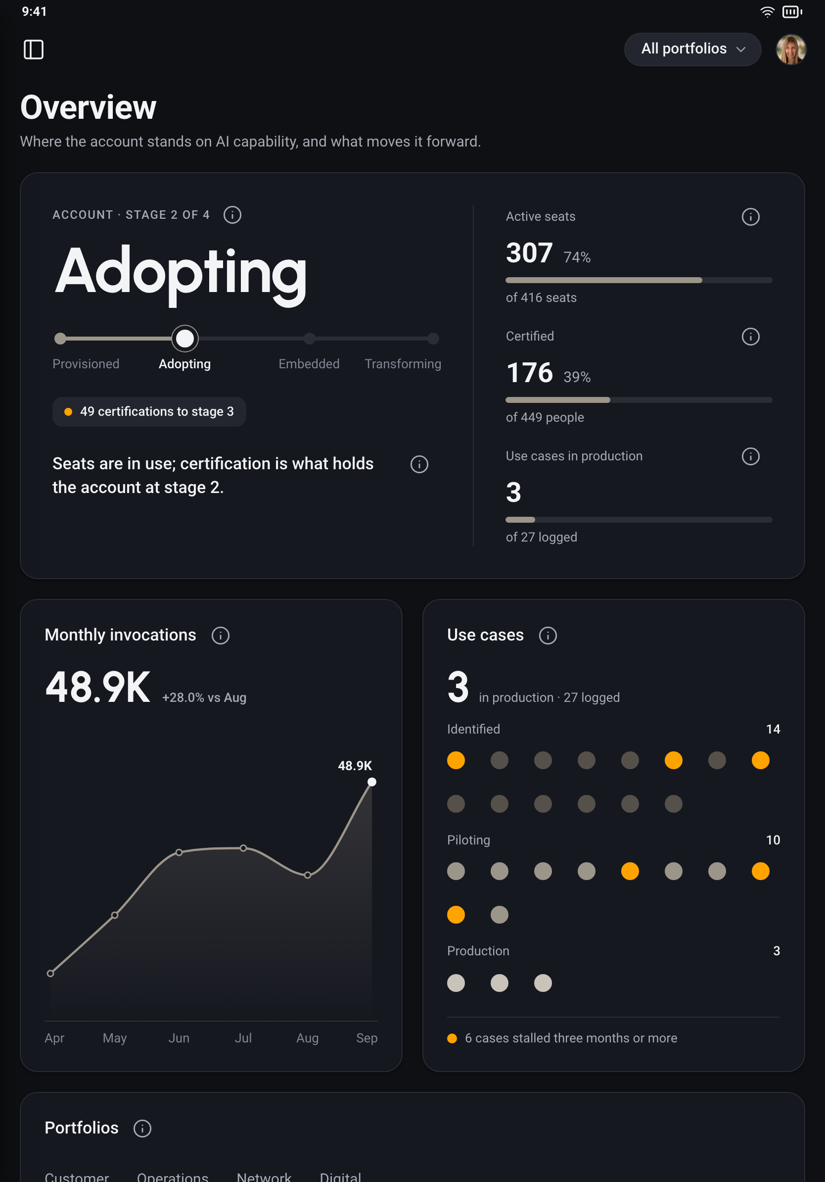
Training and use, side by side
Straight from the one-on-ones. Two populations, measured two ways. The gap between them is the finding.
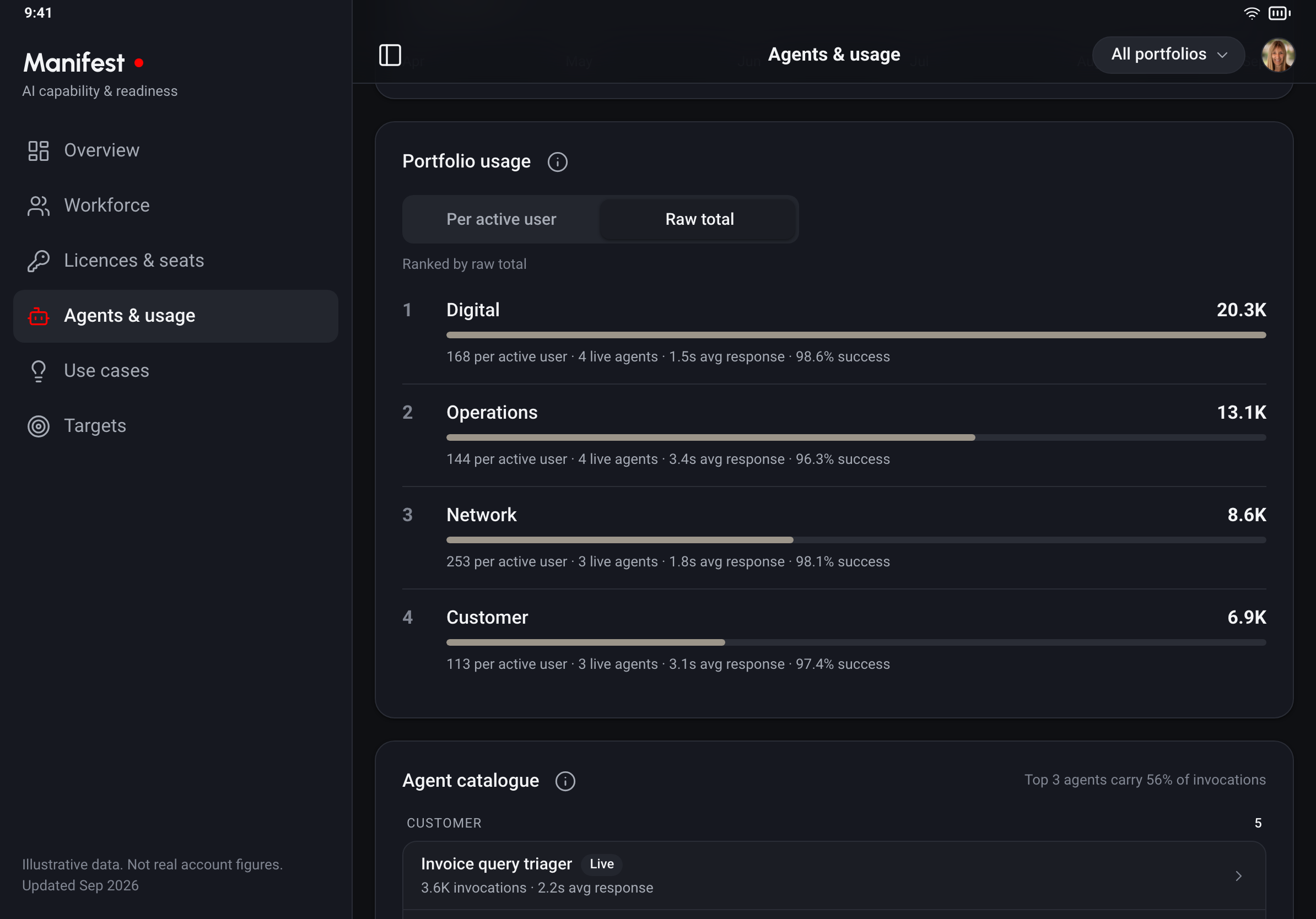
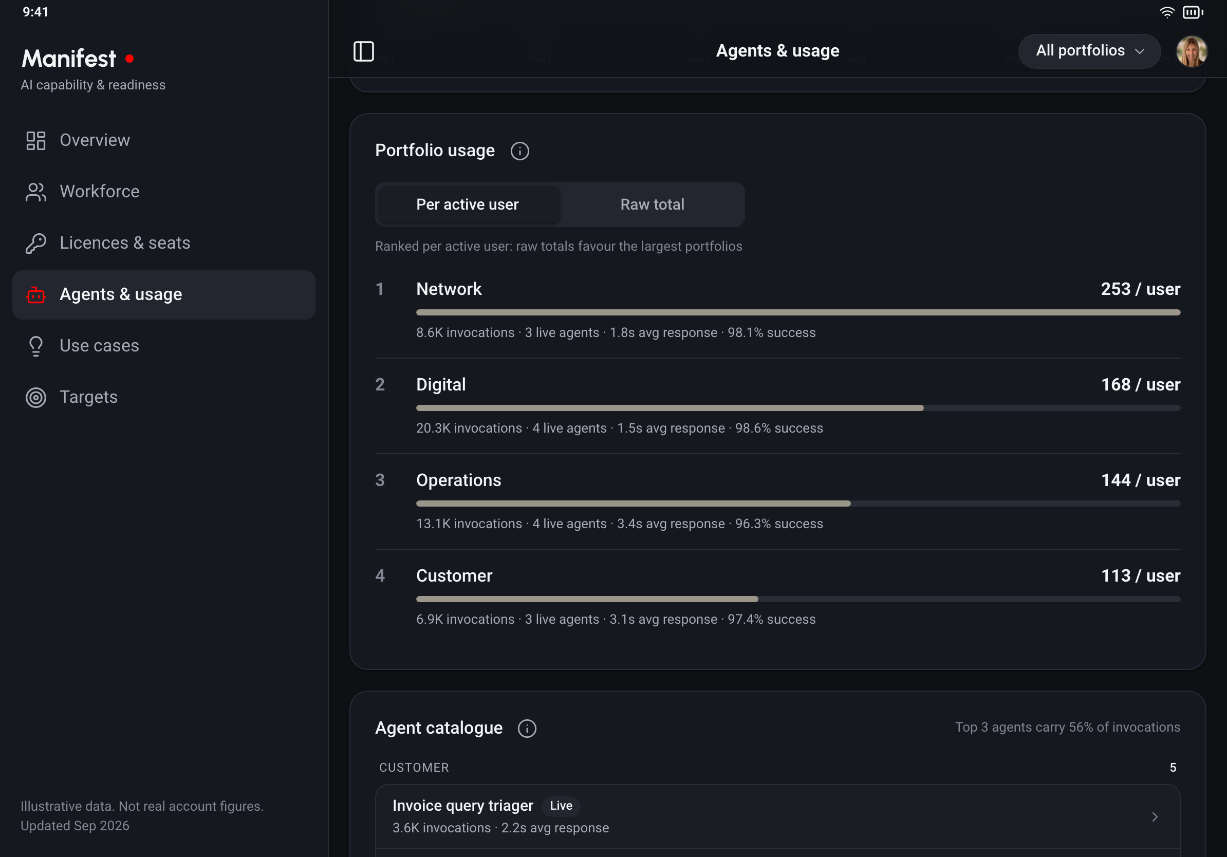
Ranking per user
Raw totals always crown the biggest team. Per active user, the smallest portfolio leads. So it's a switch, not a footnote.
One app, iPad and Mac
A native iPad app also runs on Apple Silicon MacBooks, so one build covers both. No control depends on hover, so it works the same with a finger or a trackpad.
Closing Impact
Leadership chose readiness first. The sponsor signed off on something they could use, not a picture of it. Manifest is now with the development team for the native build.
With Manifest, every portfolio lead will see what's holding them back and who owns the next step.
Manifest won't overclaim. Neither did the way it was built.
More Case Studies
E-Commerce at 35,000 feetProject type
Platform that Saved £0.25M annuallyProject type